More UI Changes!?
Just a small update on some more potential UI changes that might come. Namely, redesigning how art is shown to the player. Currently you have a rather large 'field' on which the artwork of Nal and the enemy is put - and then later where grapple and GO scenes are put. I've been thinking about altering it a bit though; changing sizes around and trying to eliminate the issue of so much unused space.

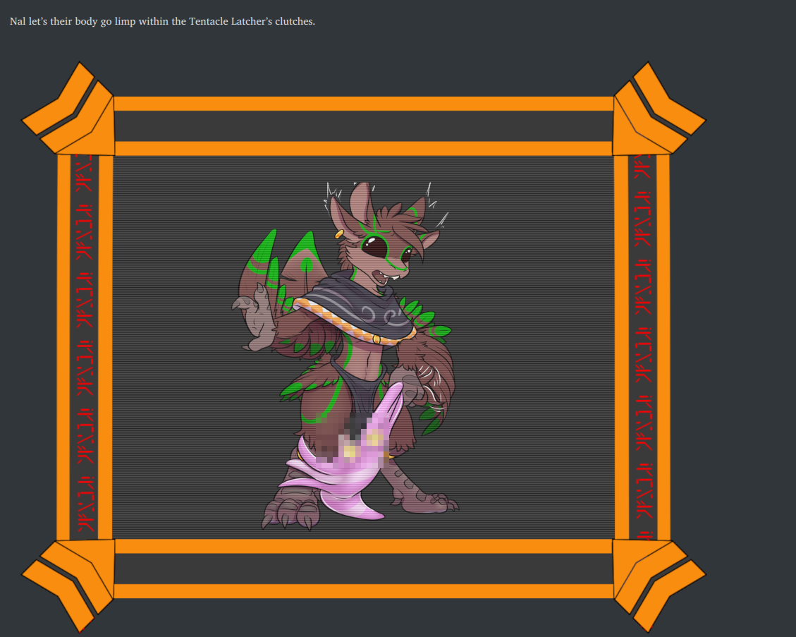
The artwork of Nal with their blade was actually meant as a size reference image by the artist when making the other artwork. So there aren't any alternative poses, nor do I have any planned at the moment (getting artwork for every enemy in the game - a total of 270~ images - is going to be a Herculean enough of a task). I feel like it doesn't add much either, remaining stagnant even as the enemy has two main 'phases'. Therefore with these changes I was thinking about removing it.
This would allow me to utilize all the 'empty space' in the small UI element I made to house the images, meaning they'd be larger even if the images themselves were the same size or smaller. Though it'd be tedious to have to change things back later, or try to re-integrate anything additional that gets put into things. So if I make this change, it'll likely stick, rather than me constantly faffing with the UI (which I've done enough of already).
I'm wanting to hear people's thoughts regarding this change! I've had a few people say that the 'meat' (pardon the pun) of the images is a little on the small side. Let me know what you think, is this something that people who have bought the game would like to see or is the current way better?
Also, pardon the typo. I didn't catch it and it'll be fixed in the next version (date TBA) - which may add some new artwork as well!
Comments
Log in with itch.io to leave a comment.
For me personally I think, that Nal being depicted alongside the enemy adds to the perception of these as scenes and not just enemy images, if that makes sense.
It didn't bother me much, that it was only one image and I think that adding more is by far not the most important thing.
And even when we come to that, I'd consider adding one or two alternate versions (e.g. for each mental state) which would be the same across every fight might already be enough. The images for the grapple states could be enlarged regardless.
I can see that it could warrent more in the future (different equipment, or other player statuses), though I wouldn't say that not having these alterations would detract from my experience very much. But that's just my opinion and I don't know how well it reflects others game experience.
I'll perhaps change it back later then, most people seem to enjoy the larger enemy images and more focus on what you are battling itself.
As you develop in your comment; it would go from one static image to three, and then to a potentially infinite number. The artwork I'm getting isn't free - and I'd rather focus on 'actiony' stuff that draws attention first and foremost!